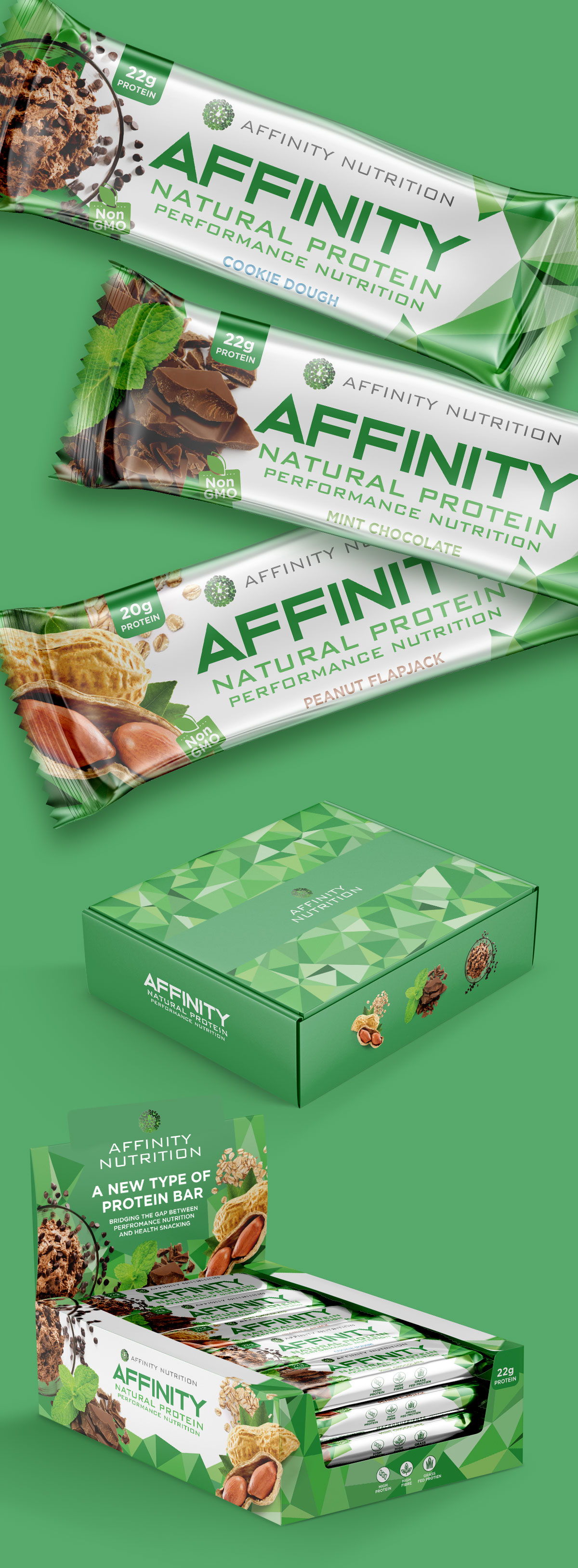
Packaging design for a range of natural protein bars developed to stand apart in a category traditionally dominated by dark, performance-focused packaging. A bright visual identity, fresh food photography, and a complete retail packaging system position the brand as a healthier, more approachable alternative.
Project Overview
Affinity Nutrition introduced a range of protein bars in three flavors—Cookie Dough, Mint Chocolate, and Peanut Flapjack—with an existing brand identity already in place. The project focused on developing packaging that would strengthen the brand’s retail presence while remaining consistent with its established visual language.
In addition to the individual wrappers, the project included promotional sample boxes and retail display packaging, creating a cohesive presentation across multiple sales environments.
Inspiration & Concept
The concept began with observing the category.
Most performance nutrition products rely on dark colors, aggressive graphics, and a highly technical visual language. Instead of following those conventions, the design takes the opposite approach, introducing a lighter palette, appetizing photography, and a cleaner composition that immediately differentiates the brand on the shelf.
The result is packaging that feels energetic without being intimidating, positioning the bars as an everyday healthy snack rather than a product reserved for athletes.
Design Solution
The existing geometric brand pattern became the foundation of a flexible packaging system that could be applied consistently across wrappers, promotional materials, and retail displays.
Large typography ensures clear communication, while generous ingredient photography reinforces flavor and product quality. Bright greens and clean white space create strong shelf visibility, allowing the packaging to feel fresh, contemporary, and approachable while maintaining a consistent brand identity across the entire product range.
The completed system demonstrates how thoughtful packaging design can reposition a familiar product category through clarity, contrast, and strategic visual differentiation.