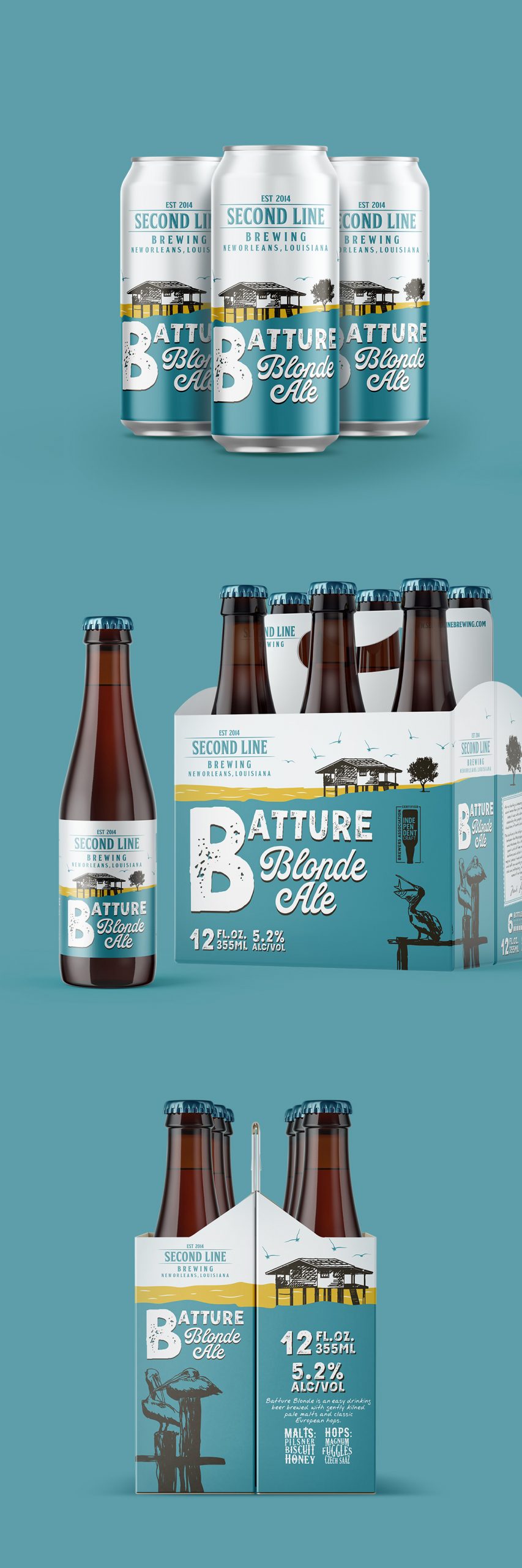
Packaging redesign for Batture Blonde Ale, extending the Second Line Brewing identity across cans, bottles, and six-pack carriers. The project preserves the brewery’s recognizable character while introducing a cleaner, brighter, and more contemporary visual language that strengthens shelf presence and brand consistency.
Project Overview
Second Line Brewing commissioned a packaging refresh for its Batture Blonde Ale, with the goal of updating the existing label while preserving the visual elements already familiar to loyal customers.
The project expanded beyond a single label to include cans, bottles, and six-pack packaging, creating a cohesive product system that reinforces the brewery’s identity across multiple retail formats.
Inspiration & Concept
The concept focused on evolution rather than reinvention.
Instead of replacing the brewery’s visual heritage, the redesign builds upon recognizable elements—including the iconic brewery building and local references—while simplifying the overall composition and introducing a brighter, more contemporary color palette.
The result is packaging that feels fresh and inviting while remaining unmistakably connected to Second Line Brewing and its New Orleans roots.
Design Solution
The refreshed identity combines bold typography, expressive illustration, and a simplified layout to improve readability and shelf visibility across every packaging format.
Consistent branding elements unite the cans, bottles, and carriers into a single visual system while allowing each format to retain its own practical requirements. The bright blue background creates strong shelf recognition, while the hand-drawn illustrations preserve the brewery’s handcrafted personality and sense of place.
The result is a flexible packaging system that modernizes the product without sacrificing the authenticity that defines the brand.