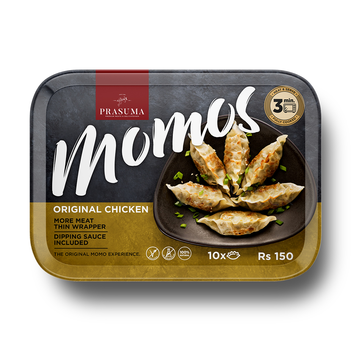
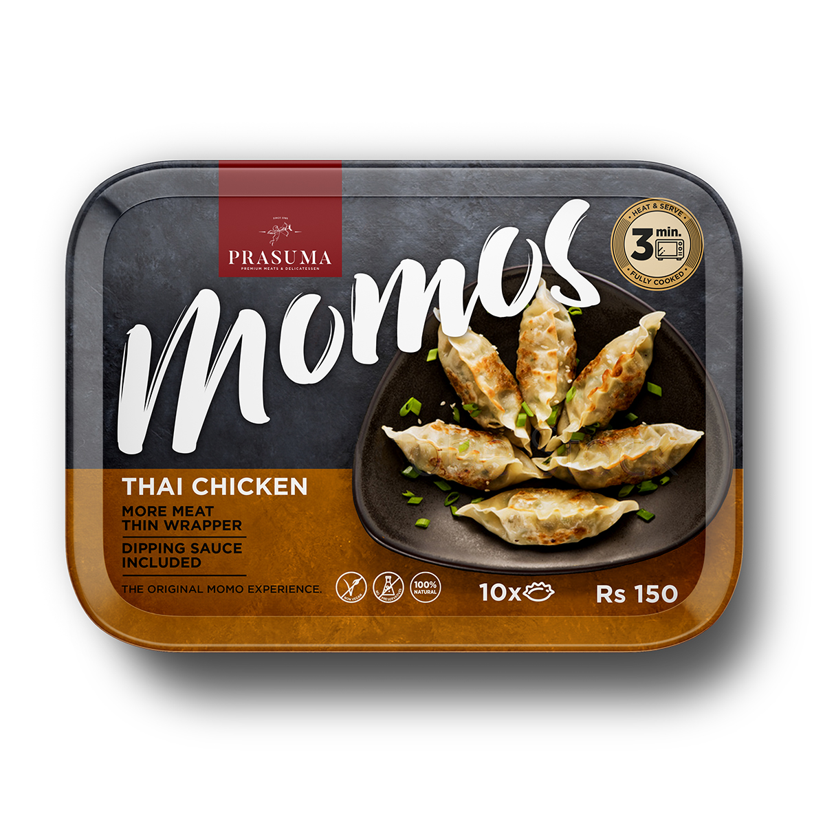
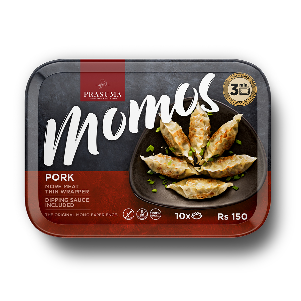
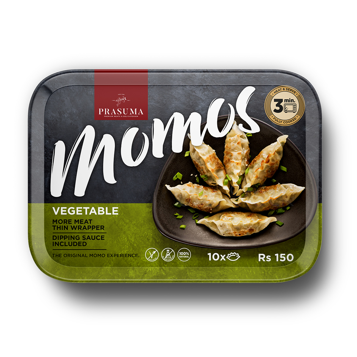
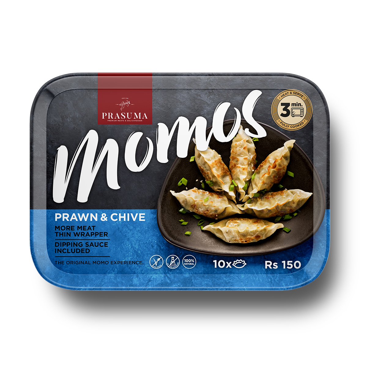
Packaging design for Prasuma’s Momos range, developed to create a flexible packaging system that could easily expand across multiple flavors while remaining cost-efficient for production. Bold typography, appetizing food photography, and a clear color-coding strategy combine to create strong shelf recognition and an inviting consumer experience.
Project Overview
Prasuma needed a packaging solution for a growing range of frozen Momos that would support multiple flavor variations without increasing production complexity.
The challenge was to design a single visual system that could accommodate future product extensions while remaining instantly recognizable and highly appetizing in the frozen food aisle.
Inspiration & Concept
The concept was inspired by the moment the product reaches the table.
Rather than presenting ingredients or abstract graphics, the packaging places freshly prepared Momos at the center of the composition, allowing consumers to imagine the finished meal before opening the pack. Large expressive typography creates immediate shelf impact, while a simple color-coding system distinguishes each flavor without disrupting the consistency of the overall identity.
The result is a packaging system that balances appetite appeal with commercial practicality.
Design Solution
The design combines bold typography, premium food photography, and a structured layout that remains consistent across every product variant.
A dark slate background enhances the warmth of the prepared dumplings, while the colored lower band provides intuitive flavor recognition and accommodates essential product information. The modular system allows new varieties to be introduced quickly and economically while maintaining strong brand recognition across the range.
The final packaging demonstrates how a clear visual system can simplify production while strengthening shelf presence and consumer appeal.