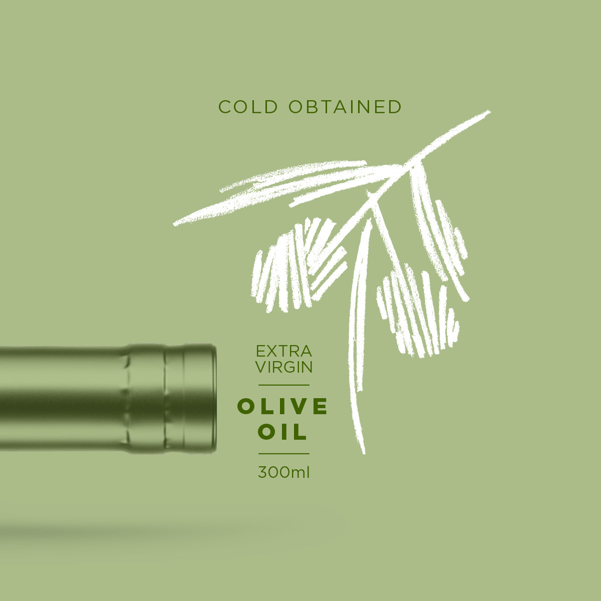
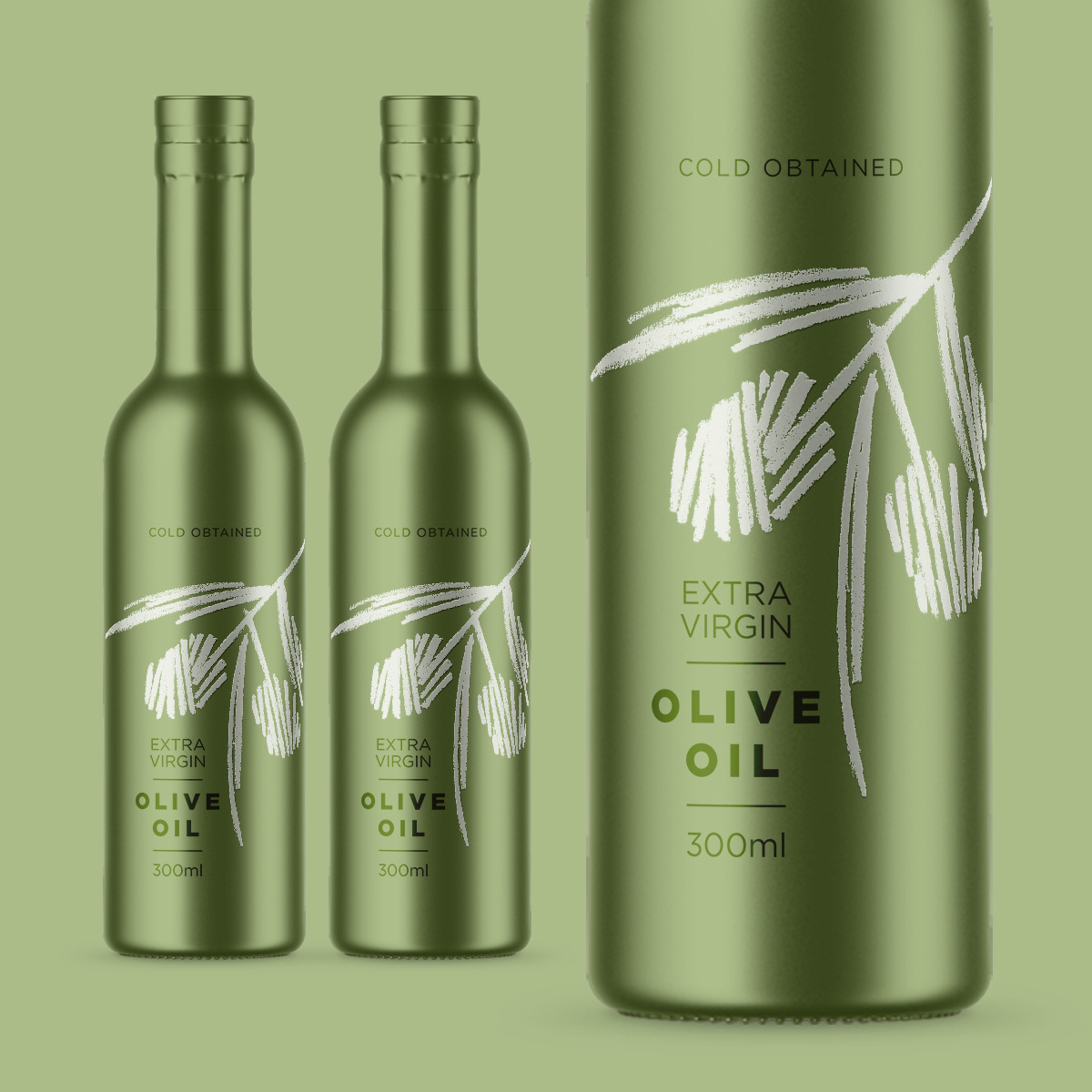
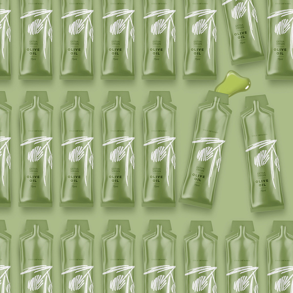
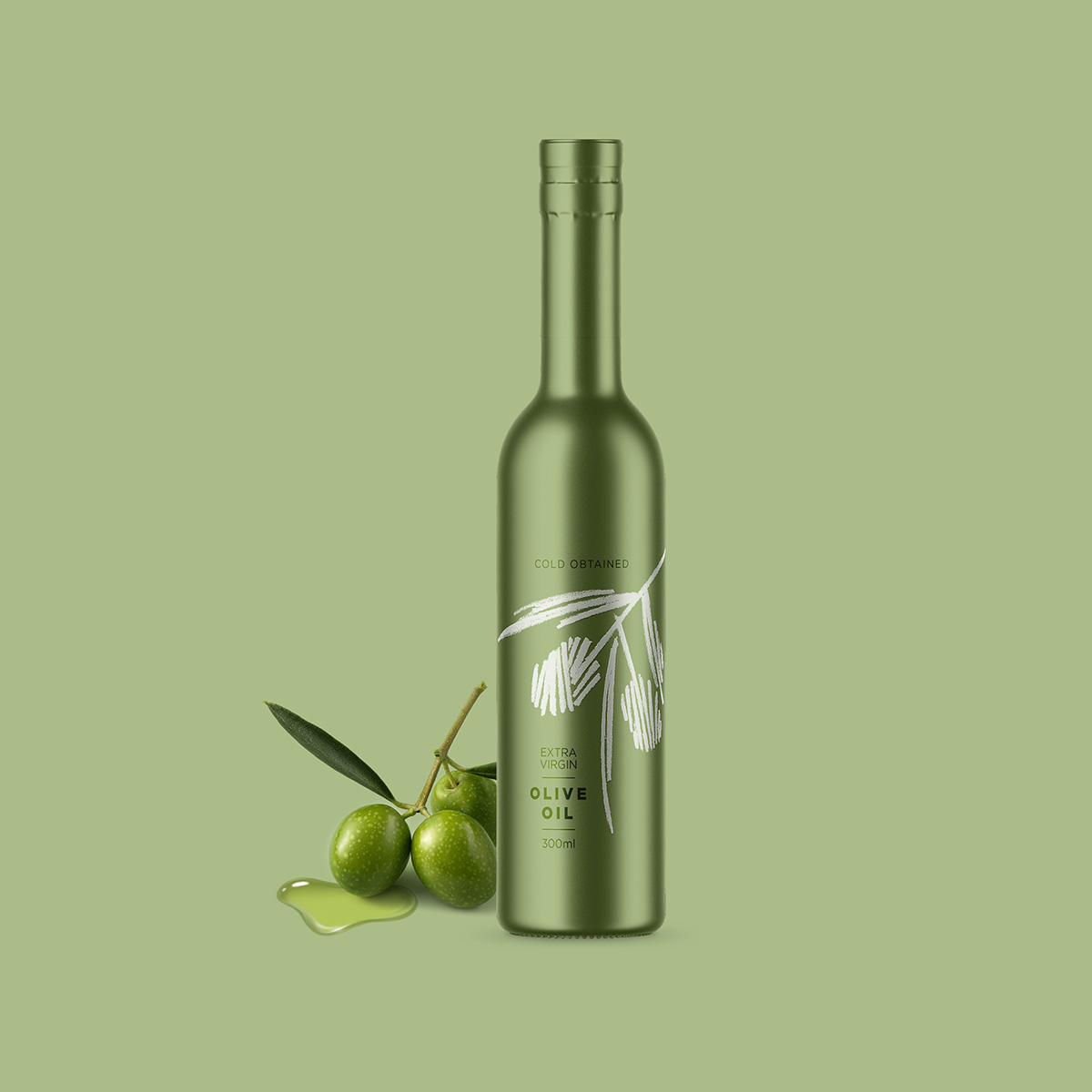
Packaging design for a premium private-label extra virgin olive oil created for a gourmet retailer in the USA. Inspired by the olive groves of Greece, the concept combines minimalist design, expressive illustration, and a refined monochromatic palette to communicate authenticity, craftsmanship, and premium quality.
Project Overview
This project was developed for a gourmet retailer introducing its first private-label extra virgin olive oil. The objective was to create a premium packaging concept that would stand out on the shelf while reflecting the product’s exceptional quality and Mediterranean heritage.
Rather than relying on traditional olive oil packaging clichés, the challenge was to create a contemporary identity that felt elegant, authentic, and timeless.
Inspiration & Concept
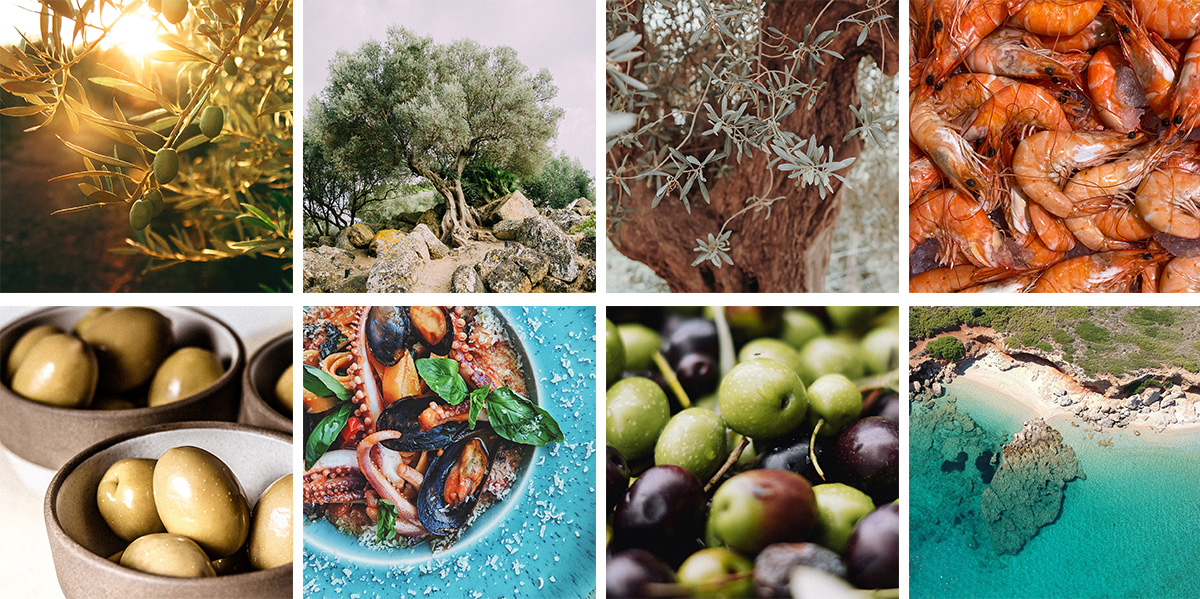
The concept was inspired by the quiet beauty of Mediterranean olive groves and the simplicity that defines truly exceptional ingredients.
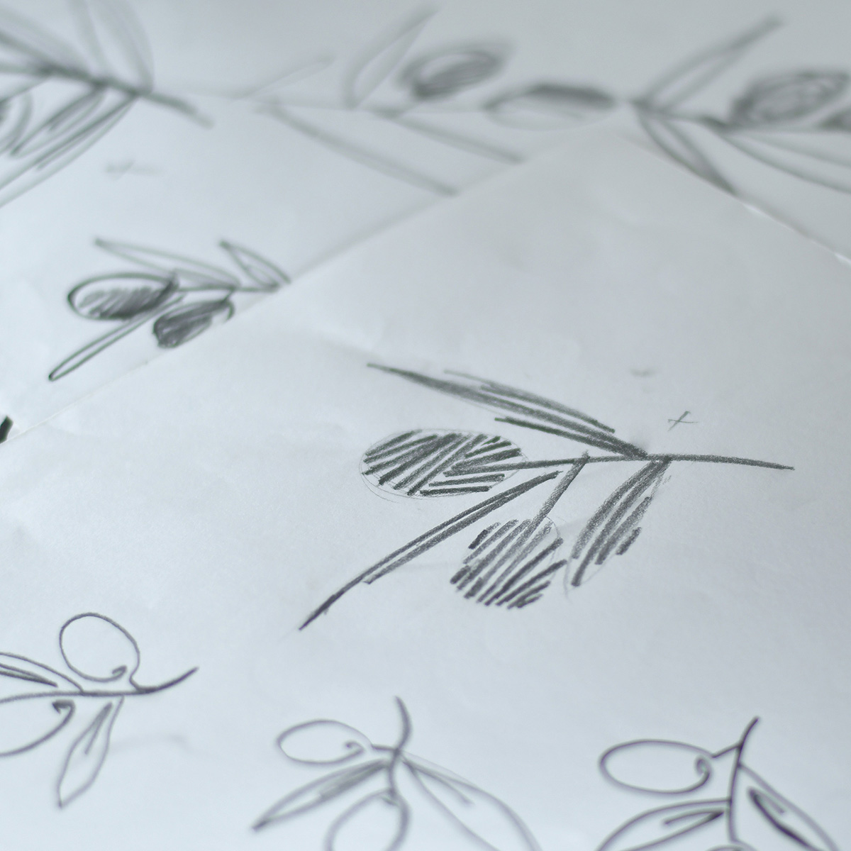
Instead of illustrating the landscape itself, the design distills its essence into a single expressive olive branch. Hand-drawn lines echo the organic rhythm of the trees while creating a visual language that feels both artistic and restrained. The monochromatic green palette reinforces the product’s natural origin and allows the illustration to become the defining feature of the package rather than competing with unnecessary decorative elements.
The result is a visual identity that communicates quality through simplicity, allowing the product to speak with confidence.
Design Solution
The packaging is built around a full metallic sleeve that transforms the bottle into a distinctive object while creating a clean, uninterrupted surface for the illustration. The subtle metallic finish adds depth and sophistication without overpowering the minimalist aesthetic.
Typography is intentionally understated, giving equal importance to the product information and the illustration. A discreet transparent window on the back of the sleeve allows consumers to monitor the remaining oil, adding a practical detail without compromising the purity of the design. The concept was also extended into a single-serving sachet and supporting brand materials, demonstrating how the visual identity can adapt across different formats while remaining cohesive.
The final result is a packaging system that balances functionality with elegance, celebrating the product’s origin through thoughtful design rather than visual excess.