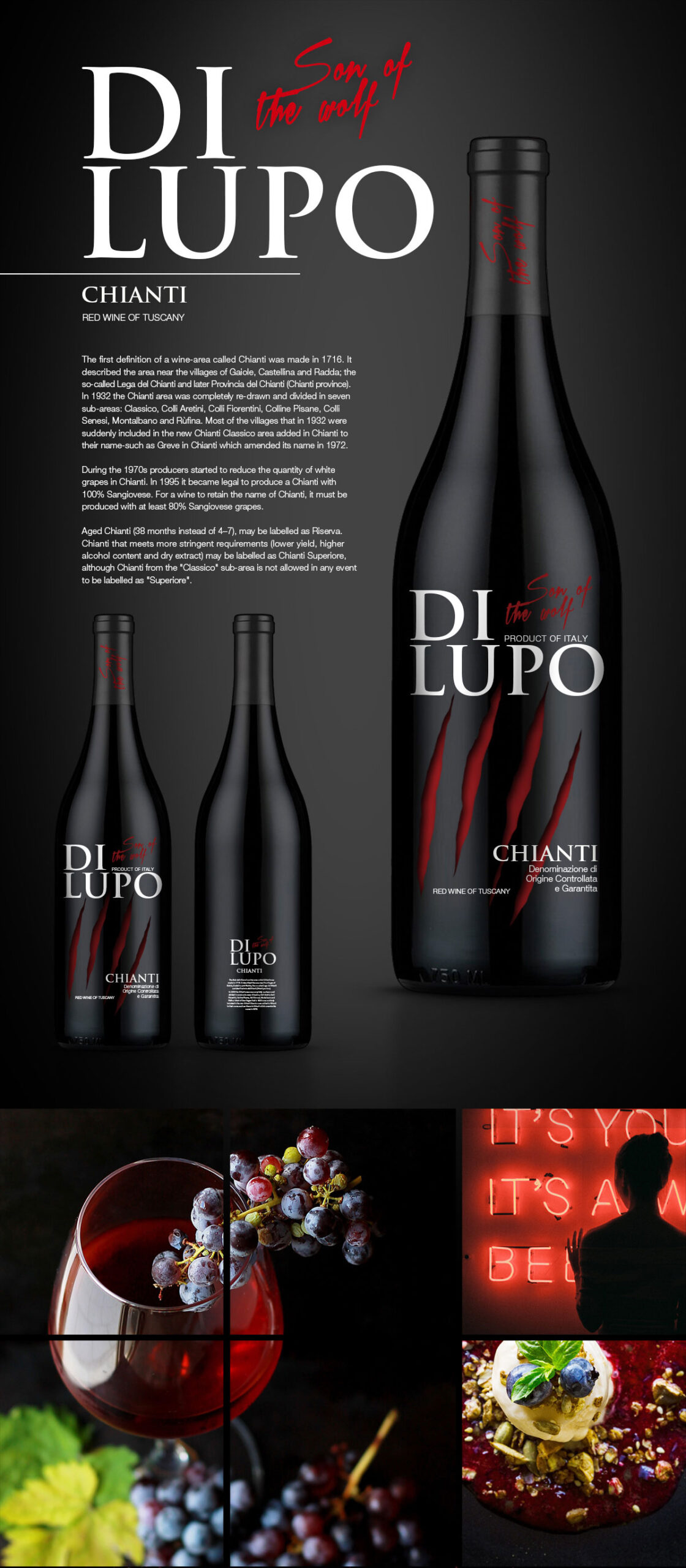
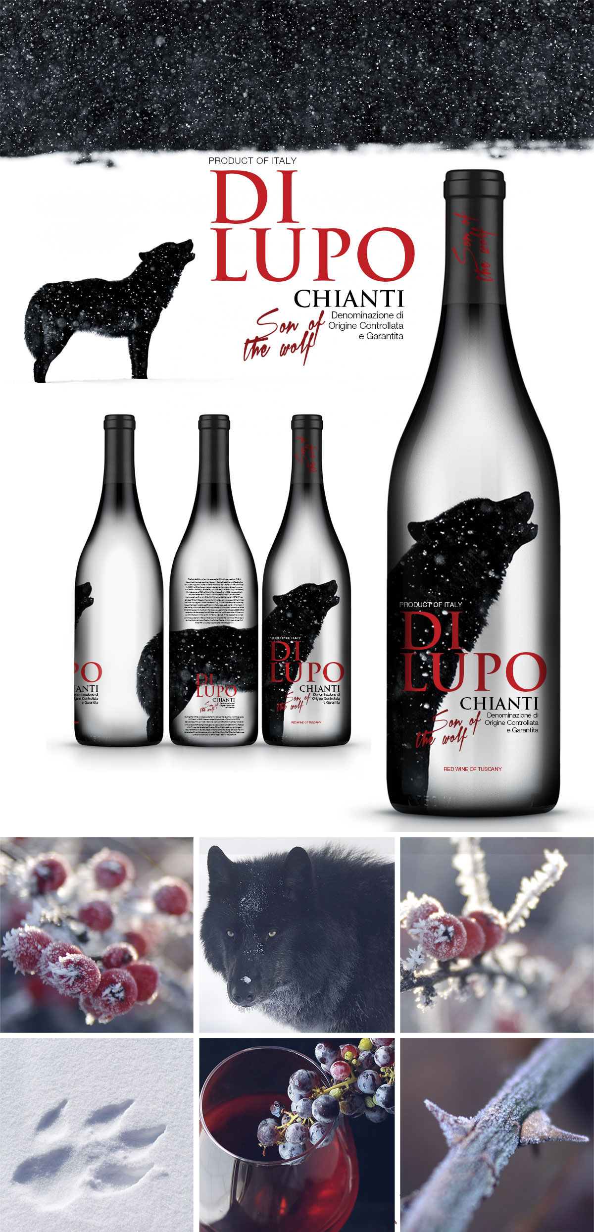
Wine label concept for Di Lupo, developed as a contemporary reinterpretation of a traditional Italian wine brand. Created as a full-sleeve label, the concept explores bold typography, symbolic imagery, and storytelling to build a distinctive identity inspired by the meaning of the brand name—” Son of the wolf.”
Project Overview
The objective was to create a premium wine label that would move beyond conventional winery aesthetics while remaining rooted in the character of the brand.
Developed as a competition concept, the design explored a more contemporary visual direction through two distinct label proposals, each interpreting the wolf as the central narrative element rather than a decorative symbol.
Although the concepts were ultimately not selected, they later attracted unexpected public attention after being published online.
Inspiration & Concept
The concept was inspired by the symbolic qualities traditionally associated with wolves—strength, instinct, mystery, and independence.
Rather than illustrating the animal literally, each proposal interprets those qualities differently. One design uses dramatic claw marks as an expressive visual signature, while the other transforms the silhouette of a wolf into a poetic landscape that wraps around the bottle. The full sleeve label format allows the artwork to become an immersive part of the packaging experience rather than a conventional front label.
The result is a pair of concepts that communicate personality through storytelling rather than ornament.
Design Solution
Both concepts combine restrained typography with bold symbolic imagery to create contemporary wine labels that stand apart from traditional category conventions.
The sleeve construction gives the artwork uninterrupted space to develop across the bottle, while the limited black, white, and red palette reinforces drama and shelf impact. Although visually distinct, both proposals demonstrate how a single narrative idea can generate multiple creative directions without losing coherence.
The final concepts explore how storytelling can become the defining element of premium wine packaging.
Although neither concept was selected for production, both remained in my portfolio as personal favorites. After they were published online, customers began asking retailers for the wine featuring these labels. The unexpected interest became so strong that the client eventually contacted me and asked me to remove the concepts from my portfolio because people were looking for a product that didn’t exist.