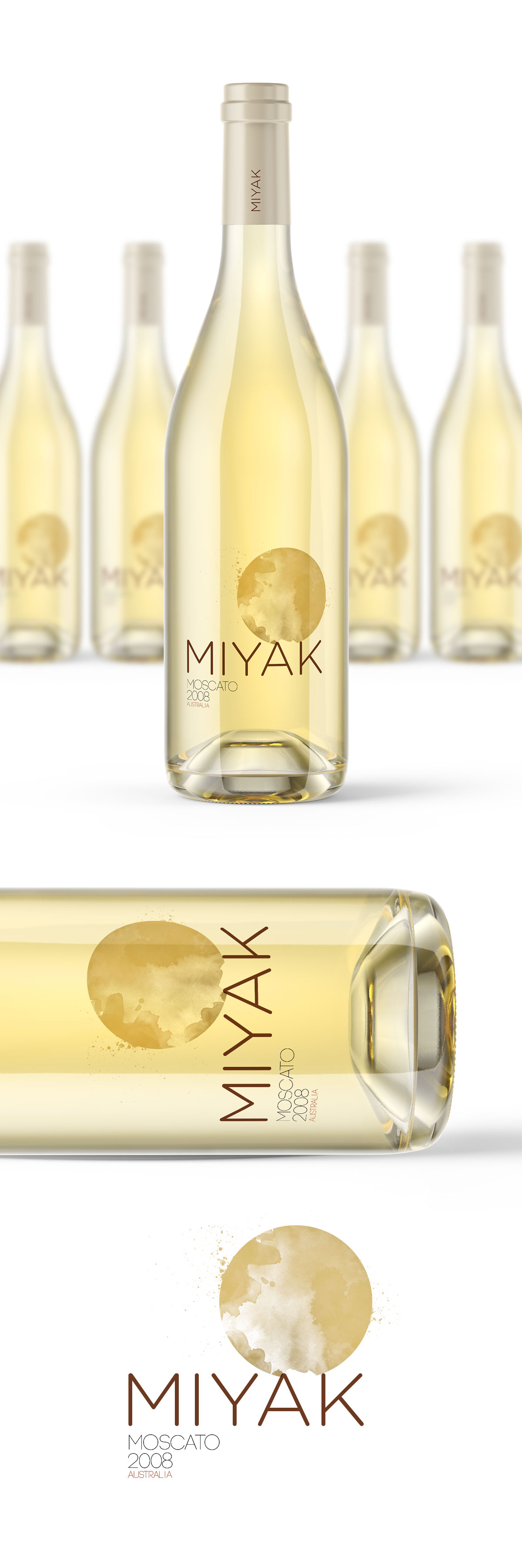
Packaging concept for Miyak Moon Wine, a premium Moscato inspired by the atmosphere of a full moon. A transparent label, delicate watercolor textures, and minimalist typography allow the wine itself to become part of the design, creating an elegant identity built around light, transparency, and subtlety.
Project Overview
Miyak Moon Wine is a premium Moscato whose name immediately evokes softness, elegance, and mystery. The objective was to create packaging that reflected those qualities while standing apart from conventional wine labels through a restrained and contemporary visual language.
Rather than relying on elaborate illustration or ornament, the challenge was to express the personality of the wine using as few elements as possible.
Inspiration & Concept
The concept was inspired by the quiet glow of the full moon.
Instead of printing a solid illustration, the moon is suggested through translucent watercolor textures that appear to float on the bottle. Combined with a transparent label, the golden color of the Moscato becomes an active part of the composition, allowing the wine itself to complete the visual experience.
The result is an identity that feels light, atmospheric, and quietly luxurious, where the packaging reveals rather than conceals the product.
Design Solution
The design combines transparent materials, refined typography, and restrained graphic elements to create a sophisticated packaging system.
Large typography establishes strong recognition without competing with the illustration, while the watercolor moon introduces softness and texture. By allowing the natural color of the wine to remain visible through the label, the packaging creates depth without unnecessary complexity, reinforcing the premium positioning of the product.
The final concept demonstrates how simplicity and material choice can become the defining elements of a memorable wine label.