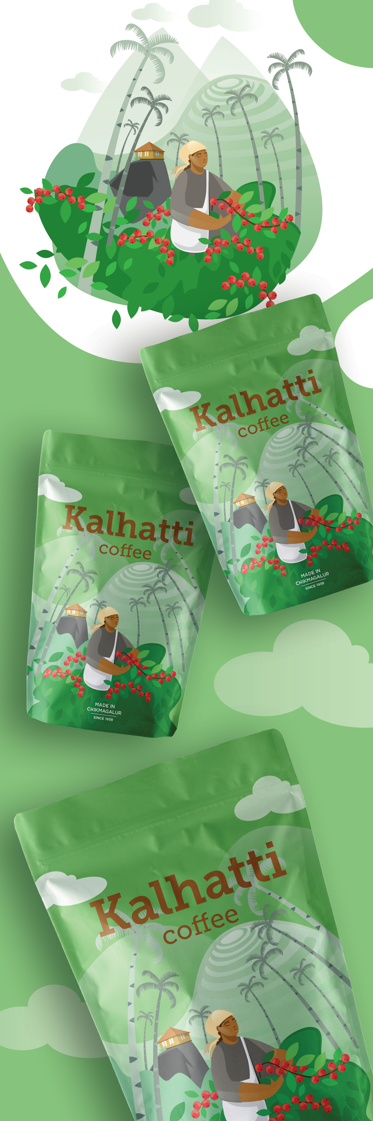
Packaging concept for Kalhatti Coffee, inspired by the coffee-growing landscapes of Chikmagalur, India. A custom illustration transforms the package into a window onto the plantation, celebrating the people, environment, and heritage behind every cup while giving the brand a distinctive contemporary identity.
Project Overview
Kalhatti Coffee takes its name from the Kalhatti Falls region in Chikmagalur, one of India’s historic coffee-growing areas. The objective was to create packaging that felt modern and visually distinctive while remaining deeply connected to the brand’s origin and identity.
The challenge was to stand out in an increasingly competitive coffee market by telling a story that extended beyond the product itself.
Inspiration & Concept
The concept was inspired by the landscape where the coffee is grown.
Rather than focusing on coffee beans or brewing rituals, the illustration captures the environment that gives the coffee its character: rolling hills, palm trees, coffee plants, and the people who cultivate them. Together these elements create a visual narrative that places origin at the heart of the brand experience.
The result is packaging that invites consumers to imagine not only the flavor of the coffee, but also the journey behind it.
Design Solution
The package combines a rich green palette with a full-panel custom illustration that wraps the product in a sense of place.
Warm typography contrasts naturally with the lush greens, while the illustration provides both immediate shelf recognition and an emotional connection to the brand’s story. Instead of separating illustration from packaging, the artwork becomes the identity itself, giving the product a memorable and authentic presence in a crowded marketplace.
The final concept demonstrates how storytelling through illustration can elevate a small coffee brand and communicate its heritage with clarity and warmth.