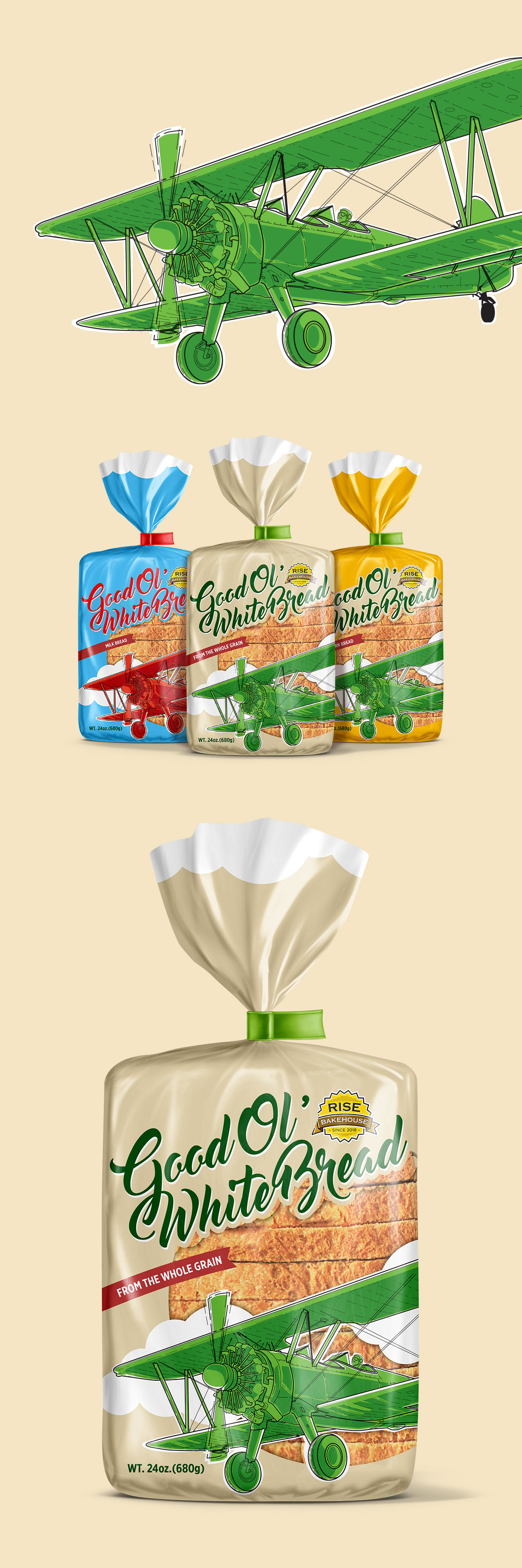
Packaging concept for a range of everyday bread products that transforms softness into a visual story. Inspired by the idea of light, fluffy bread, the design combines expressive illustration, bold typography, and color-coded variants to create packaging that stands out in a highly competitive bakery aisle.
Project Overview
This packaging concept was developed for a family of sliced bread products, including white, whole grain, and corn bread varieties. The objective was to create packaging that would immediately attract attention while communicating freshness, softness, and quality in a category often dominated by conventional bakery imagery.
The challenge was to develop a distinctive visual identity that remained consistent across multiple product variants.
Inspiration & Concept
The concept began with a simple question:
What if softness could become a visual metaphor?
Instead of relying on traditional bakery symbols, the design introduces a vintage airplane flying through the clouds—a playful representation of bread so light it feels ready to take flight. The illustration brings movement and personality to an everyday product while reinforcing the idea of freshness and lightness in a memorable way.
Color coding differentiates each variety while maintaining a unified visual language across the collection.
Design Solution
The packaging combines hand-drawn illustration, expressive typography, and bold color accents to create strong shelf visibility across the product range.
The airplane illustration acts as the central brand asset, while the flowing script typography reinforces the friendly, approachable personality of the product. A consistent layout allows the different bread varieties to be recognized instantly, with color providing quick navigation between flavors.
The result is a cheerful packaging system that brings character and memorability to an everyday staple.